SaaSDashboard UX
Lumen.
An analytics dashboard redesigned so founders read it in thirty seconds.
- Client
- Lumen Analytics
- Year
- 2024
- Role
- Product designer
- Timeline
- 6 weeks
The challenge
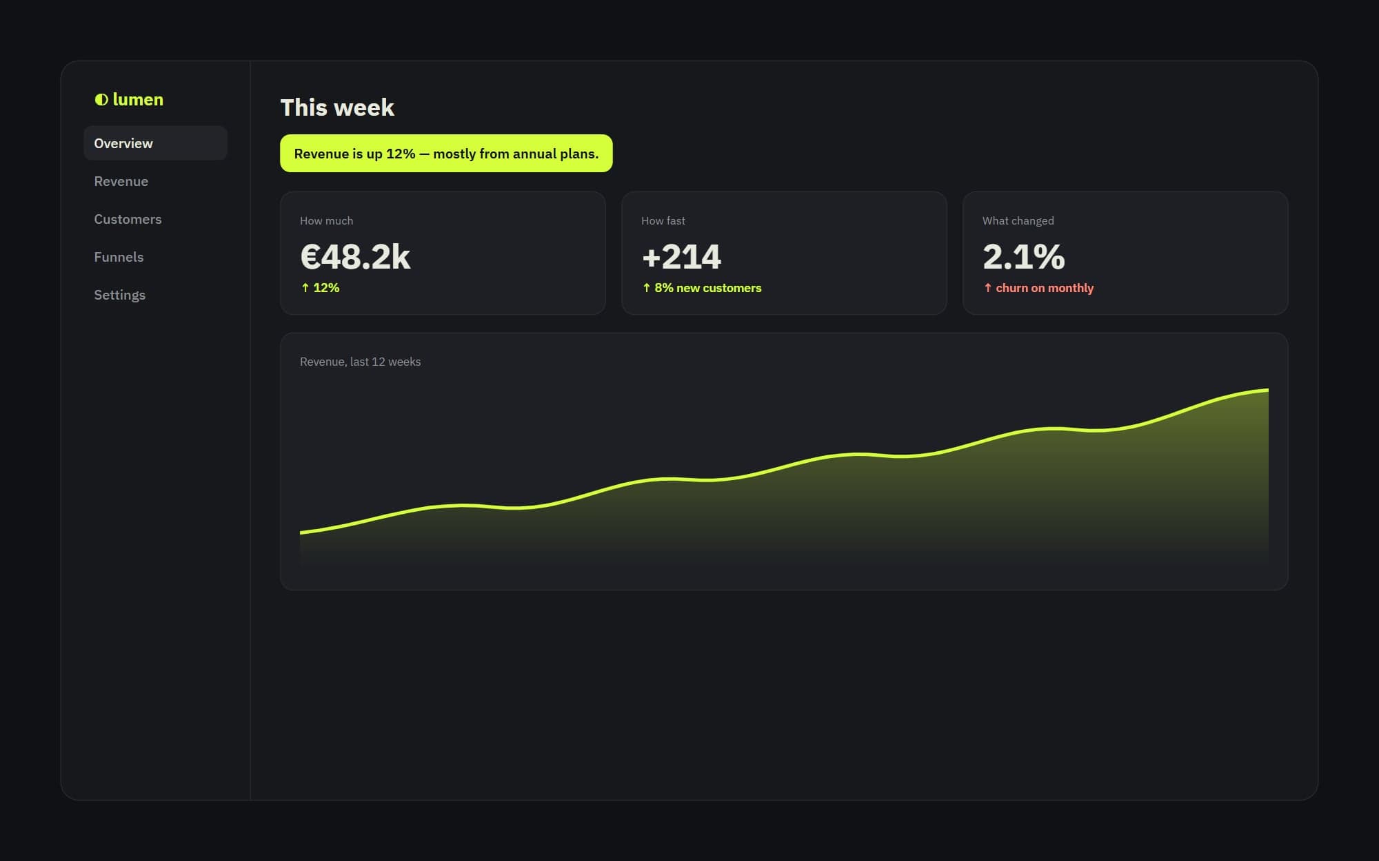
Users opened the dashboard, saw fourteen charts and closed it. The data was good; the hierarchy wasn't.
The approach
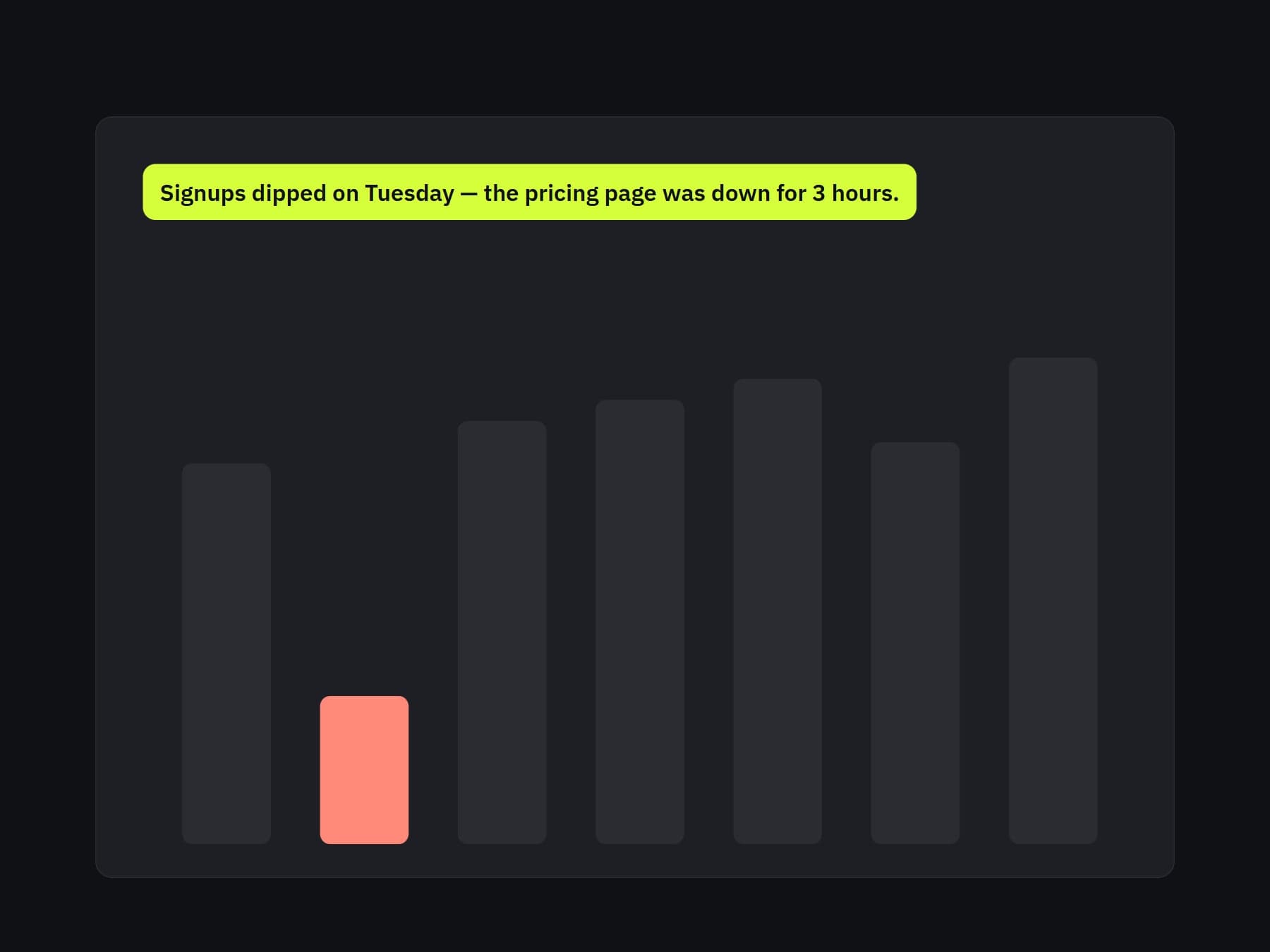
We cut the default view to three questions — how much, how fast, what changed — and moved everything else one click away. Every chart got a one-sentence plain-language summary on top.
The outcome
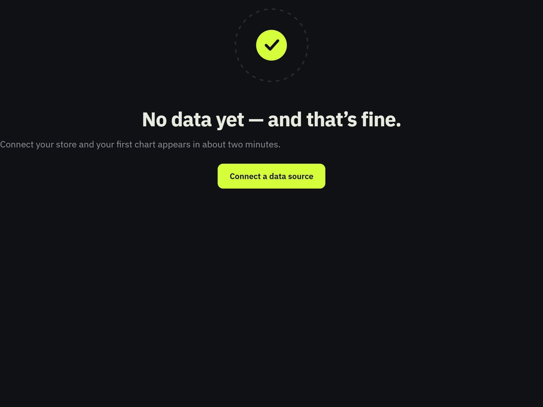
A focused dashboard, a reusable chart system with consistent colours, and friendly empty states for new accounts.
Deliverables
- Dashboard redesign
- Chart system
- Empty states
In numbers
- 14 → 3
- charts on the default view
- 30s
- to read the week
- 1
- chart system
Next projectHalden