Brand identitySignage
Orrery.
A new identity for a small planetarium that wanted to feel modern without losing its wonder.
- Client
- Orrery Planetarium
- Year
- 2025
- Role
- Brand designer
- Timeline
- 8 weeks
The challenge
The old logo was a clip-art planet and the ticket office used six different fonts. Families loved the shows; the brand just didn't tell anyone.
The approach
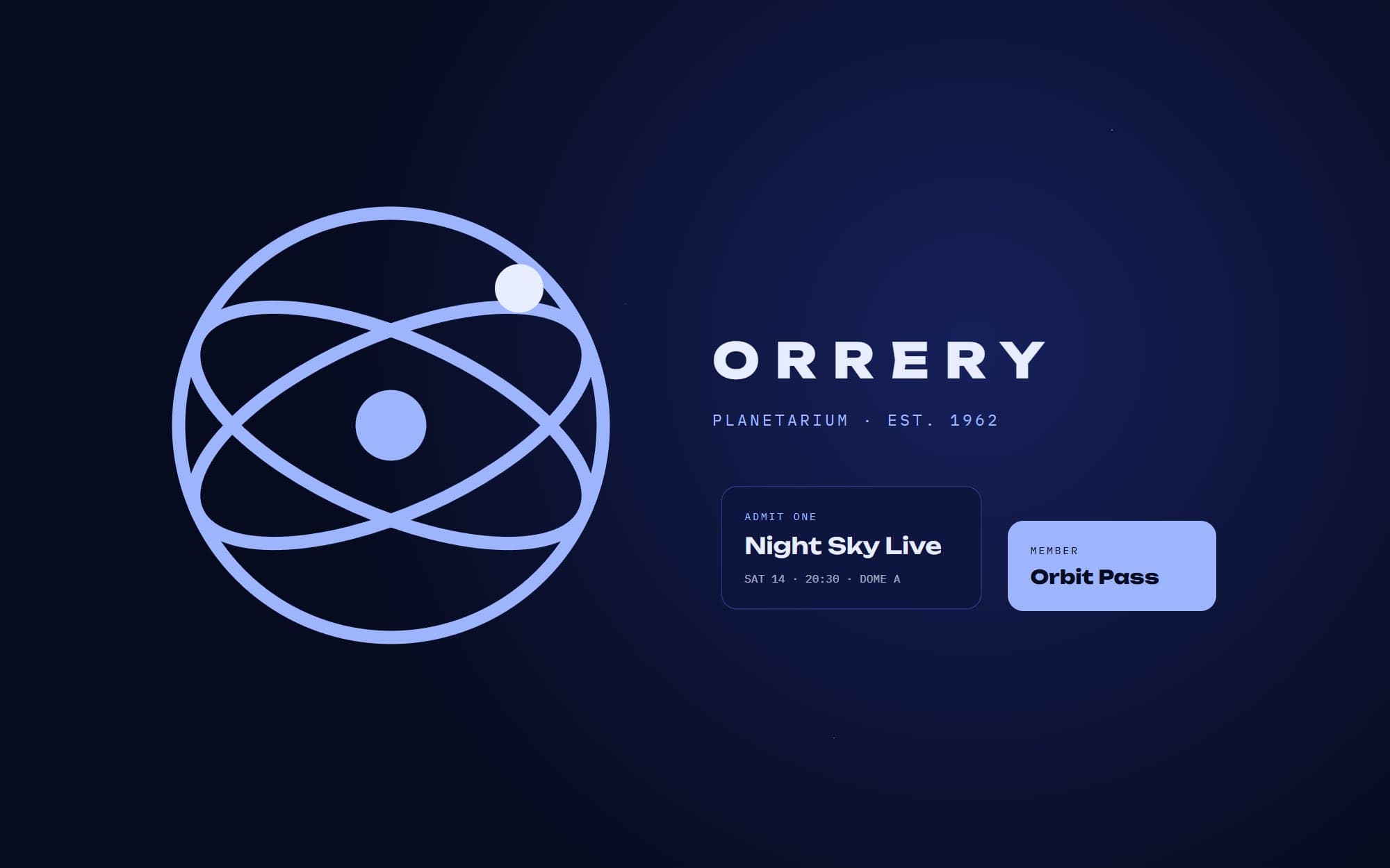
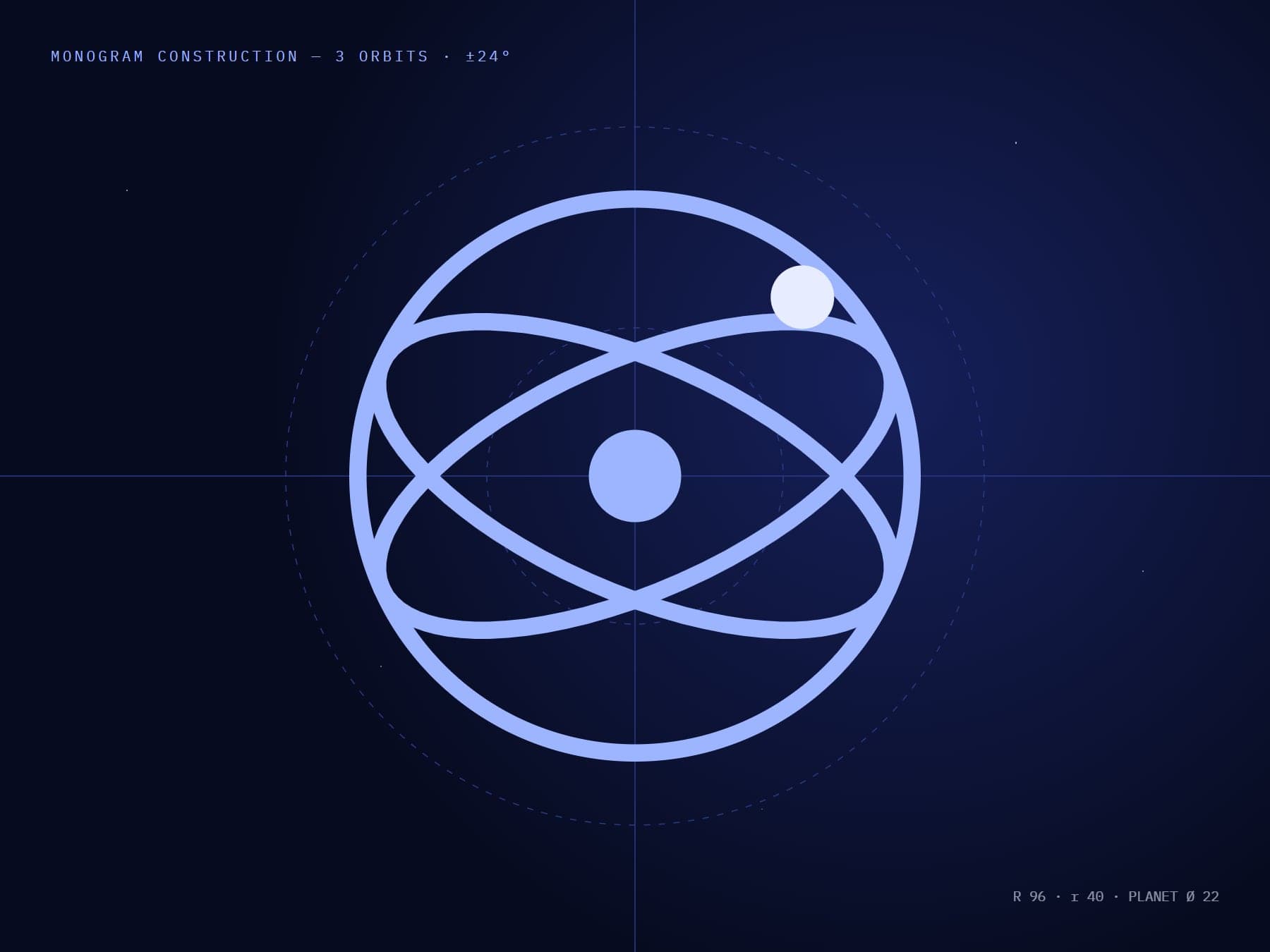
The mark is built from the orbits of a mechanical orrery — three rings that also form an 'O'. A deep-night palette with one luminous blue keeps it calm by day and striking at night.
The outcome
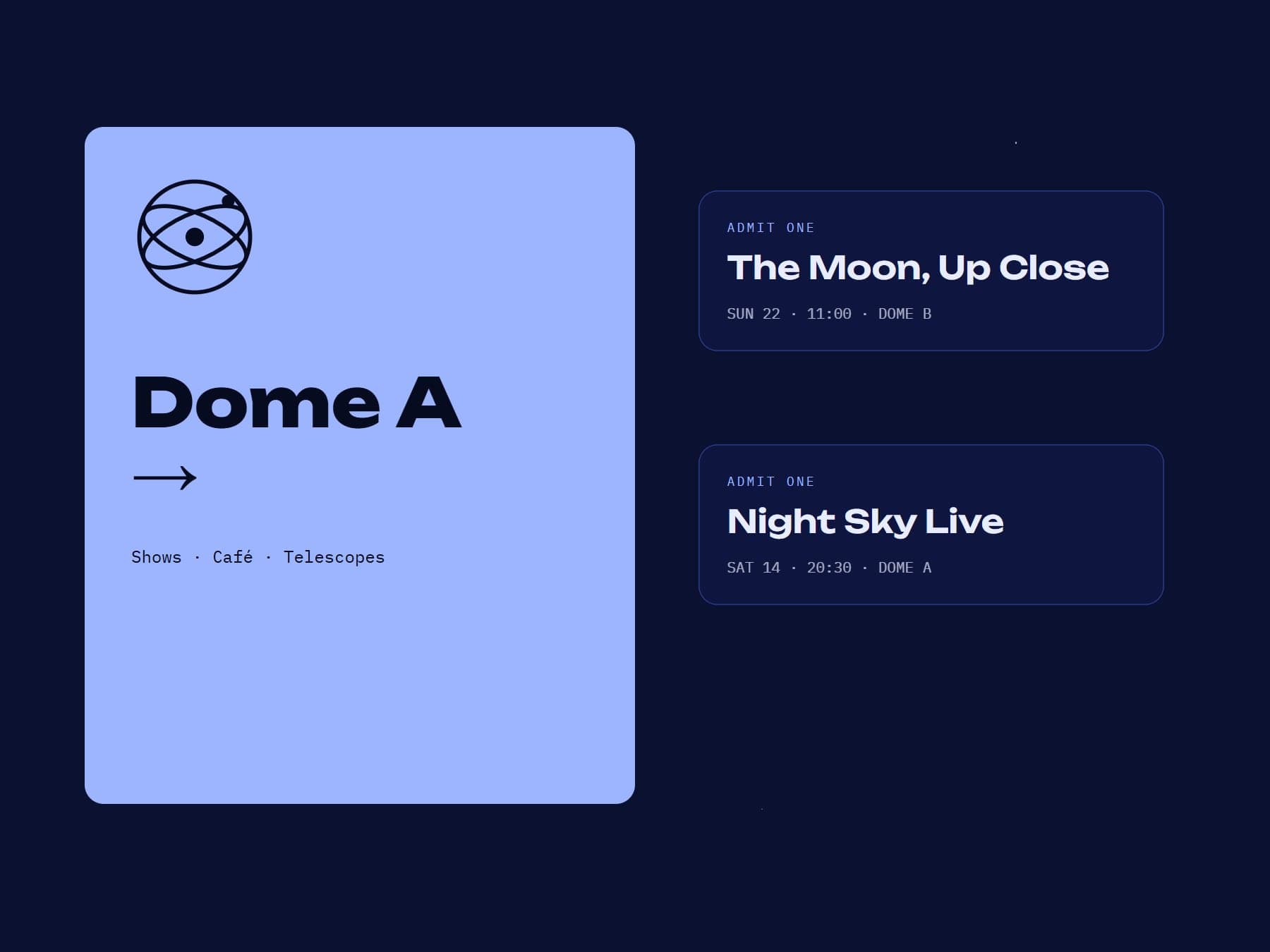
A complete identity system rolled out across tickets, signage, the website and merchandise, with guidelines the in-house team now uses on their own.
Deliverables
- Logo & monogram
- Type & colour
- Signage
- Guidelines
In numbers
- 3
- rings, one monogram
- 6 → 2
- typefaces
- 48
- page brand guide
Next projectFerrum